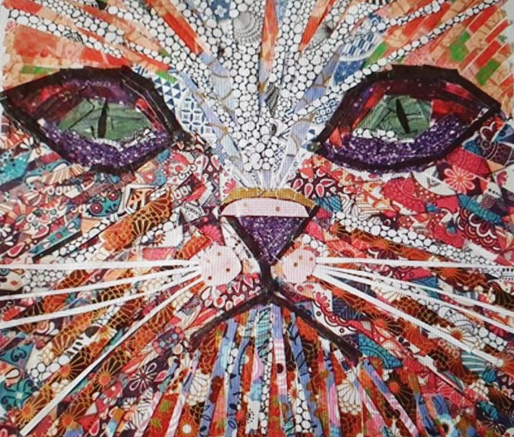
This was one of my first collages, it was the first time I’d collaged straight onto canvas and realised I loved it. I have two gorgeous black cats and I love their eyes so I started with the green eyes. I also had this beautiful paper left over from a craft kit so I cut it into strips and went along the lines of a tabby cat but with a lot more colour. I exhibited this in my first ever art trail, Rochford 2019 – incidentally where I was born! and it sold!! I was delighted. I’ve had lots of requests for Whiskers since, there is only one original Whiskers though, meow.
This item is available as a greetings card (5X5) £2.

LIBERATOR – OLD LEIGH
This is my favourite boat in Old Leigh. It seems to have been a constant for me for many years, always in that same spot, unless they are out fishing. Ive watched them unload the cockles, seen it go up and down on the tide, it’s a standout colour and looks impressive whether moored or at sea.
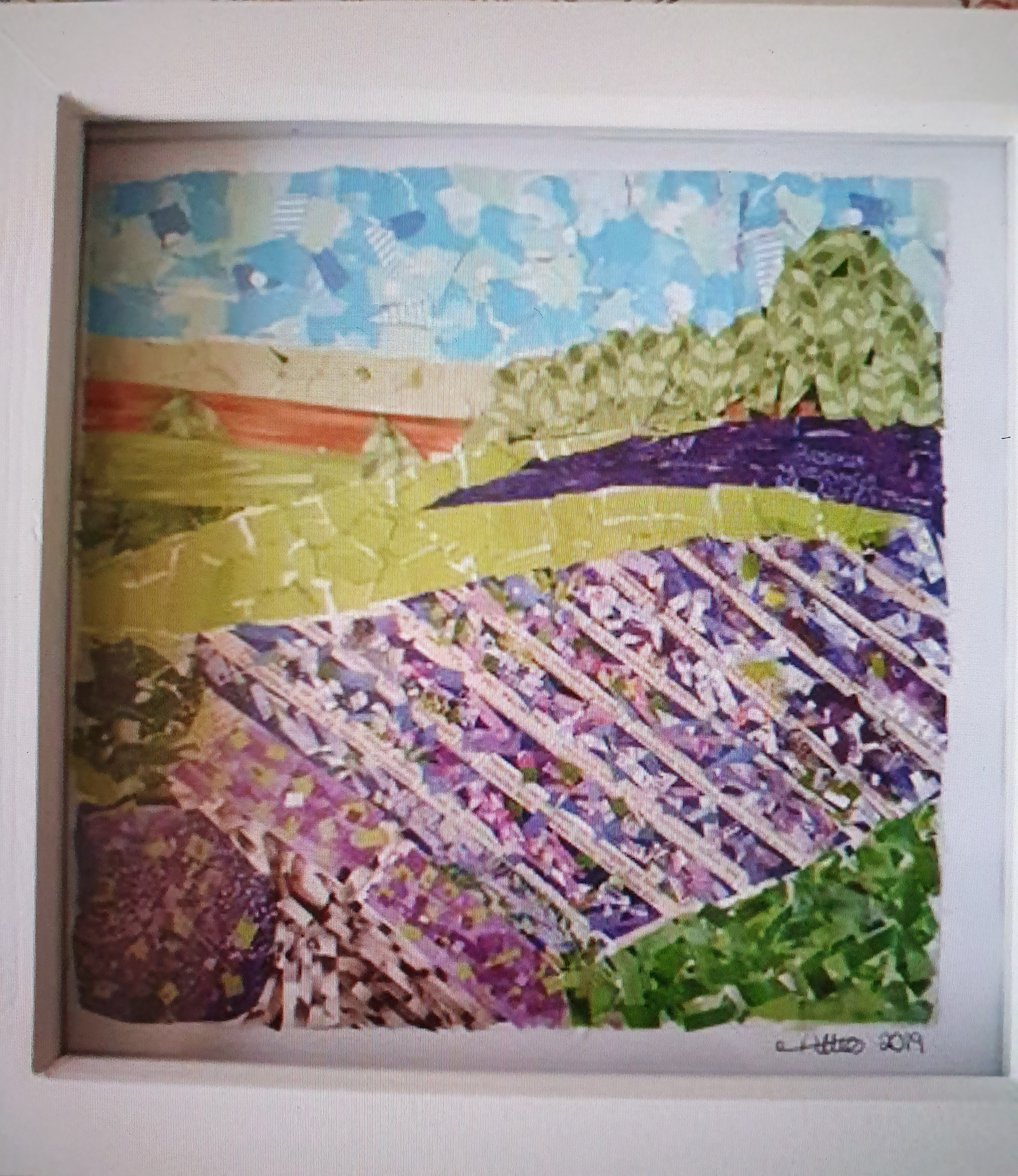
YORKSHIRE LAVENDER FARM
This is a view over the top hill of the lavender farm in Yorkshire. the colours are stunning and the smell glorious. I sat at the bottom of the hill with a friend by the pond watching dragonflies flit above it before walking around in this purple sea.
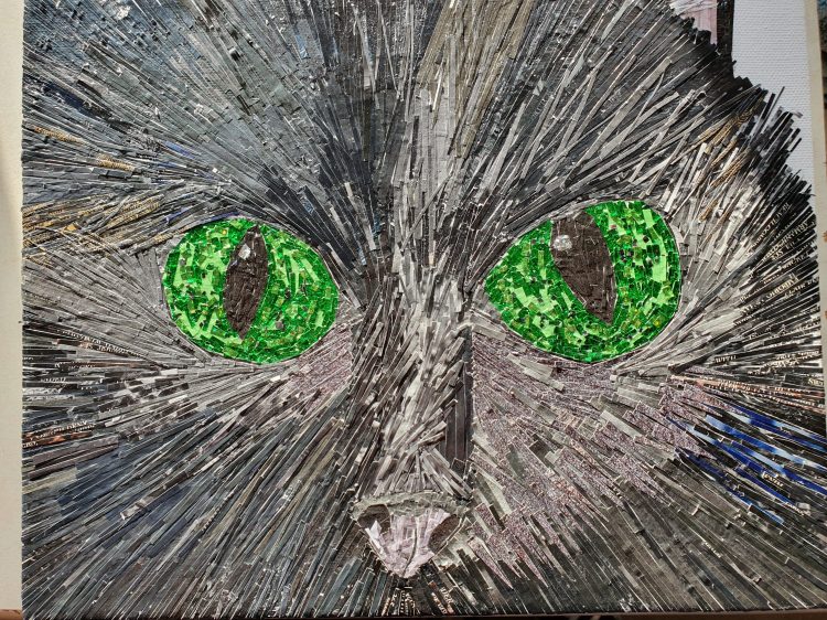
As the title says, My baby boy, one of my two black cats. I wanted to show that black isn’t really just black, its all shades of grey, copper, blue and black depending where the light hits the fur. I started with his big green eyes using tiny squares of holographic paper and flecks of black paper. I used silver to show the light in his pupil. The hardest job was remembering to go with the lay of the fur.
A part finished version of this is what makes up my logo.
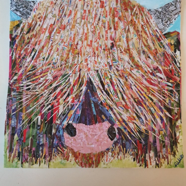
HIGHLAND COW – CANT SEE!!
I was asked to do a highland cow closeup. When I said yes I underestimated how difficult the sweeping fringe would turn out to be! Cutting long thin strips and then making them flick like hair and sticking each piece on one at a time. Its a 6×6 inch piece but it took a long time to do because of this. I then had the challenge of where the eyes went, I had moved them about 3 times thinking no still doesn’t look right when I decided the obvious answer was his eyes were obscured by his fringe! And so was born Cant see….He is cheekily poking his tongue out too, naughty boy!
This print is available as a greetings card (5X5) £2
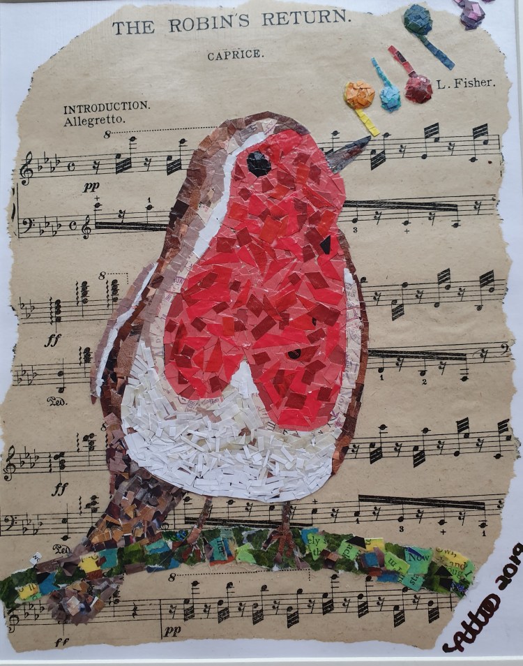
This was an early piece for me, I had wanted to collage a robin for a while. One morning I was going through some music in a second hand shop and I found this piece entitled ‘The Robins Return’. From there the piece was born. If you look closely you will see lots of very small pieces. My collages are built up in layers so that it sits off of the paper and the colours blend, this one has at least 4 layers, in some places up to 6. The robin has lots of representations for people, Some believe it is a sign from their loved one. When I saw this particular music that’s why I wanted to use it as a background.
Available as a greetings card (6×4) £2, or an A4 print £5
I wanted to explore that big green eye some more, this time in profile. I am always intrigued with the way cats eyes come out like a perfect dome of glass from the side. I made this one a bit playful with the addition of the hearts for whisker dots, these are from peacock feather print.

This was a very special collage for me to do. It is a representation of the door of the retreat house I go to in Yorkshire that has helped me so much over the years and made me feel like a member of the family. It is the door to Holyrood House in Thirsk. It is taken from using a photo of the door and recreating it using all the things that the retreat means to me. Its people, its gardens, its art, it’s beliefs and above all the ethos that there is a place for everyone, there really is there.
holyroodhouse.org.uk

This piece was created during lockdown 2020. I have attended an art group for the last year which has really helped with my confidence. During lockdown the studio Manager has kept the art group going over WhatsApp and honestly it has been a saving grace for me during a time where I couldn’t leave the house at all for 50 days, then only for brief walks. On our chat one of the ladies talked about it being up and down all the time, mood wise, trying to keep yourself ok with existing health issues and now this. While she was talking I had this picture of the rollercoaster of life come into my head and this came about. I used online pictures to find the right sort of roller coaster, and went from there. It was my first time collaging people and I found the easiest way to do it was to cut out the skin shape and then dress them like tiny dolls! The stalls would be my favourites at a carnival, nice hotdog with onions, then a game of tin can alley, then a bag of candy floss to take home.
The links to open arts, the art group I mentioned are on on my contacts page.

This was my first commissioned piece. After the birth of Whiskers, I was asked to produce another one. Whiskers 2 is a bit moodier in look with a darker lower face and turndown on the mouth. The stand out feature is the flashing green eyes made with holographic paper so they seem to have life in them, also the addition of gold leaf on the nuzzle.
Available as a greetings card (5×5) £2
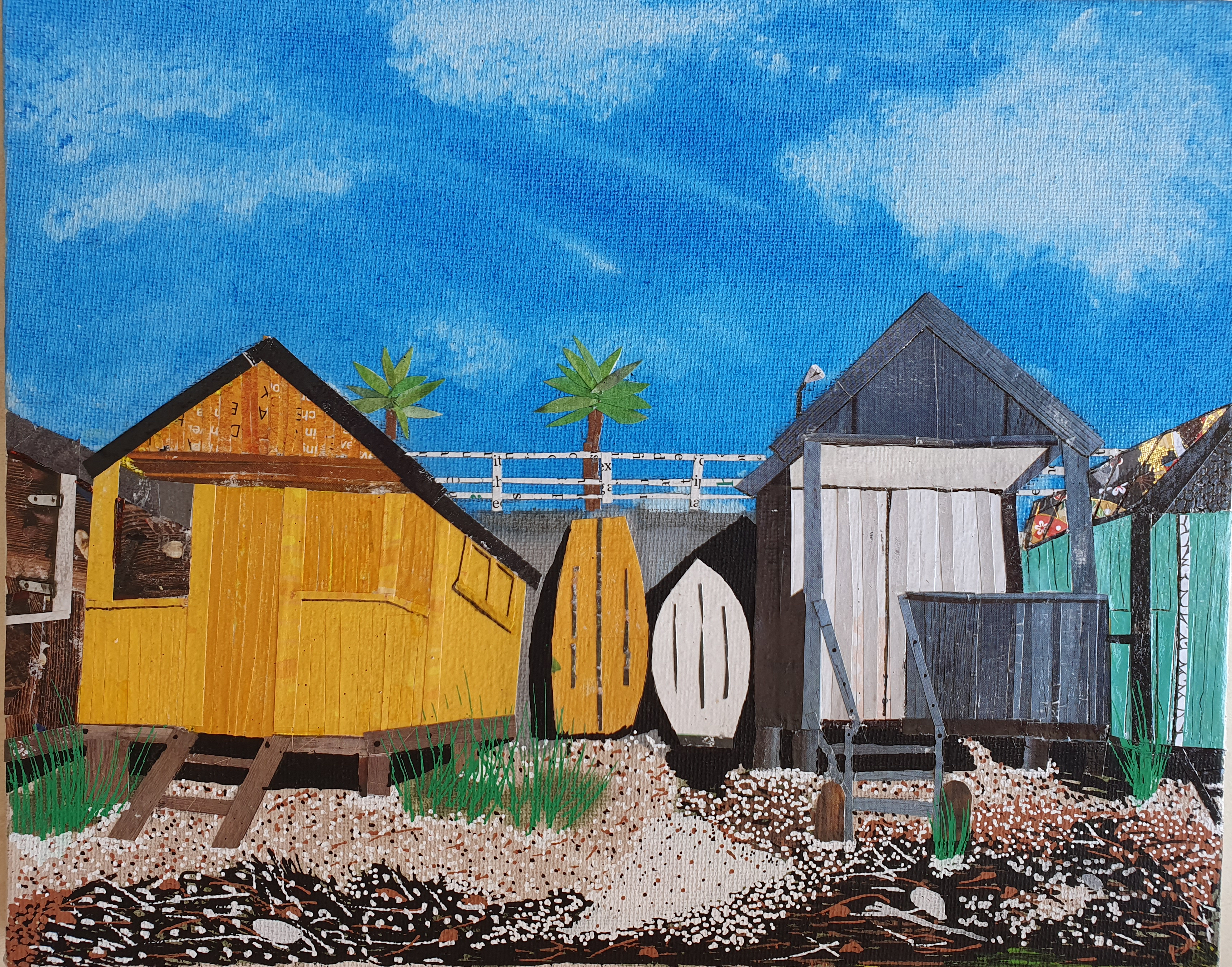
THE BEACH HUTS – THORPE BAY BEACH.
Ive lived in Southend my whole life and Thorpe Bay down to Shoebury common has always been my favourite bit. My early life was very turbulent, the sea however, even though turbulent as well, always felt safe, secure and reliable. It has always been the place I go to. I have hundreds of photos of beach huts over the years, this without doubt is my favourite. It was actually taken in October but it was a clear blue day. I loved the difference between the bright yellow hut and the unpainted one and the boats in between. The hut on the far right has been given my artistic licence as I like to have some sort of sparkle in my pictures! So the roof had to be reinvented with gold embossed paper and the colour amped up a bit.
Available as a greetings card (4×6) £2
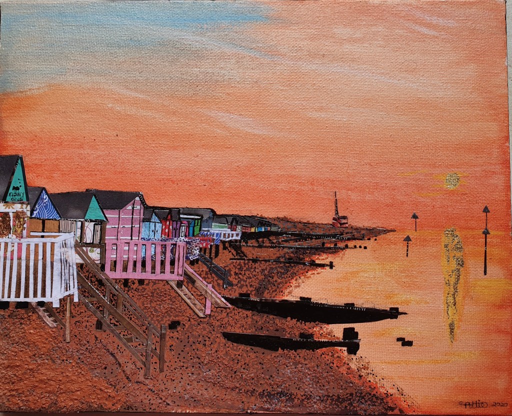
THE BEACH HUTS AT SUN SET – THORPE BAY
When the sun sets and the sky goes this wonderful orange colour, the sea does as well. This particular evening it was all orange and gold from the sun with the reflection in the beach hut windows. To pick this up a little more I have collaged the sun with gold leaf, the beach hut in the foreground also has gold leaf on the windows to show the reflection of the light.
Available as a greetings card (4×6) £2

THE BEACH HUTS IN THE SNOW – THORPE BAY
This was my third in a set of beach hut studies in different weather conditions. I love the way the beach looks with snow on it. It never really stays long but this was the morning after a big snowfall and everything had an inch or so on it. Again the sky and sea become almost the same colour, a very light blue grey, the sand seems black against the snow and sea being so light. The pier jutting is out in the distance.
Available as a greetings card (4×6) £2

My next challenge for myself was portraits, could I make a human face look, well.. human as collage. I picked a subject very close to me and a cute picture that I could keep looking at. It was hard going at first and I wasn’t sure it was happening, it only really pulled together once I was brave enough to put grey and black in the creases to show lines under the eyes, around the nose and on the neck, suddenly she came alive on the piece of paper. Grandad knew who it was straight away which was a good sign off for me! She is now hanging on his wall.

Juxtaposition
This has easily been the most complicated piece of work so far. I had taken this photo towards the end of July 2020 from the top of Pier Hill which looks over both Adventure Island and the Pier. They sit there in stark contrast to each other. The pier and water around it all calm, cool muted colours and very little in the way of buildings. Then the area in front, bright primary colours clashing with other, each piece jammed up against the next, jostling for space, A cacophony of colour and sound in front of this tranquil setting, a real juxtaposition.
The background is an acrylic wash with the far coast and the pier then starting in collage. It is then built up in small paper pieces, sometimes multiple layers, the trees for example are at least 5 to 6 layers in places of finer and finer pieces. Each ride took a day to complete. The whole thing is finished off with fineliner pens to bring out details and shadows. Its then coated in Modpodge to give it a final finish. It took me almost 4 weeks to complete.
A change to the actual photograph is the posters on the fence, I wanted to capture the moment this was representing which was Summer 2020, a very odd place to be, our NHS at the forefront of our minds as we moved around.
Southend Helter Skelter
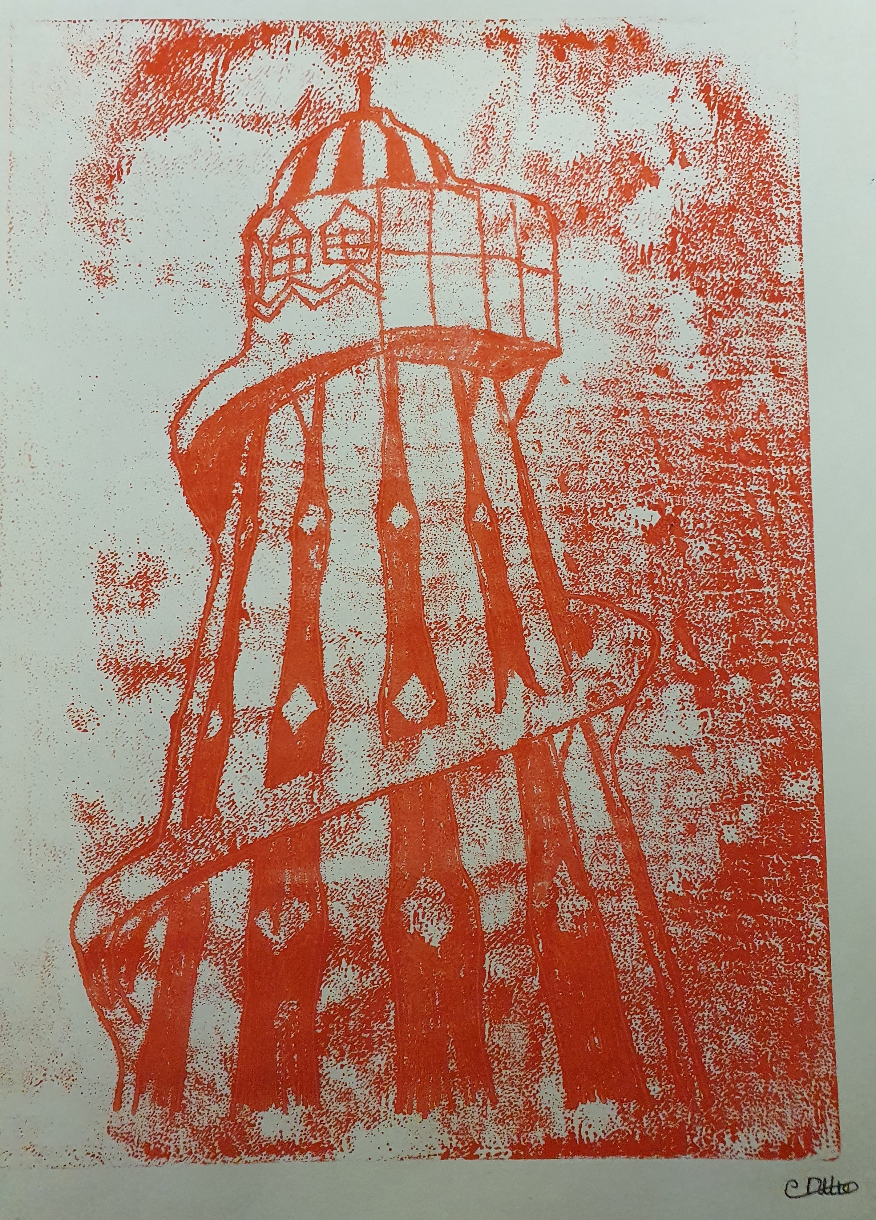
This was the first time I tried monoprinting, this was drawn mono printing where I drew the image onto the plate after covering it with ink. And the subject matter… the iconic Helter Skelter at Adventure Island.
Its over 70 years old and the owners of the amusement park have spent over £100,000 in restoration on it. Im glad though, its been there all through my life and the town for me wouldn’t be the same without it.

The day Concorde flew over the estuary
This iconic scene is from Southends first airshow in 1986. Concorde was the star of the show and actually did a double fly past with 150 passengers on board on a trip round the Bay of Biscay to Heathrow.
This first year of the airshow was the only year it cost to get in, 6 foot fencing was erected all the way along the top of the cliffs to stop people entering without paying.
There would have been thousands of people watching from the shoreline, on the beach and along the cliffs. At ground level there would be miles of stalls to see of every type from fairground to army assault course, food truck to flight simulators.
I was in the Girls Brigade at the time and my job along with my friends was to sell programmes for £1. We had a ball!! It was a very hot day and I remember getting a sunburnt forehead.
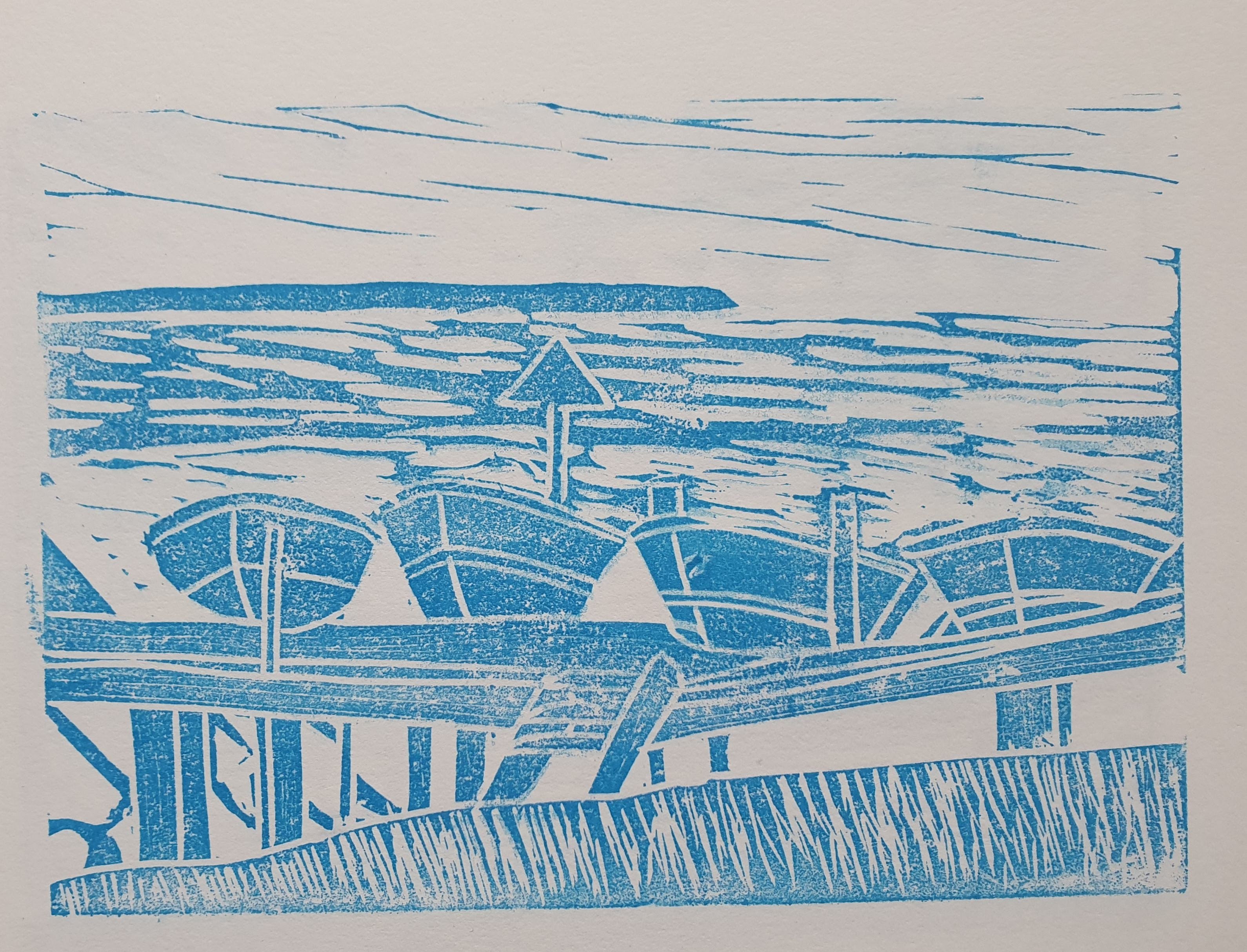

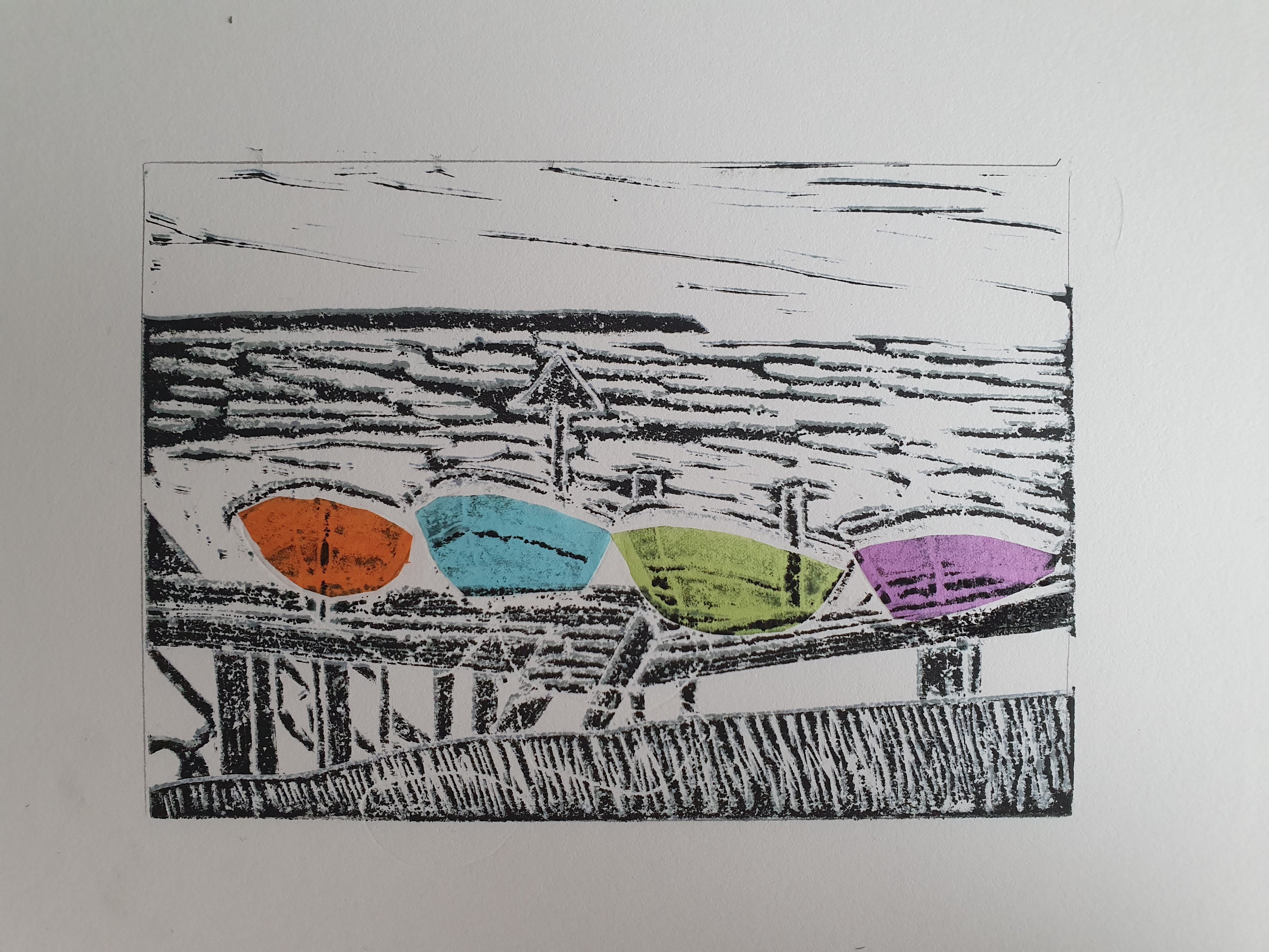
Rowing boats lino cut three ways!
In January 2021 my Art Studio Manager invested in a pfeil lino cutter for me, I was delighted, it allowed me to linocut with greater precision than I had been able to before.
My subject matter is a group of boats that are always out on a slipway on one of the beaches near where I live. They are all different colour and look amazing.
After I took the first print in the one colour blue, I decided it would be good to experiment with the colours of the boats. I did each one individually and then the black ink last.
The last technique is called Chine-Colle and it involves sticking tissue paper on to areas of the paper to be inked first, in this instance I decided to use the colour for the boats again. After the tissue is on, the black in plate is applied as normal. It was a very pleasing technique. I liked the way one image can evoke such different qualities with just different applications.
